



You can now explore the Taj Mahal and other Indian monuments through Google Street View
Feb21
on February 21, 2014
at 2:32 am

You can now immerse yourself in the magnificence of India’s iconic Taj Mahal and 29 other monuments from the country, simply by making your way through Street View on Google Maps.
India’s Taj Mahal is a much-admired heritage site globally, and is included as one of the new seven wonders of the world. For those who can’t make it to India, Google has brought the Taj Mahal to you.

After announcing in October last year that it was working with the Archaeological Survey of India (ASI) to bring the Street View Trekker to 100 Indian heritage and cultural wonders, Google has now come up with 360-degree panoramic imagery of 30 monuments. You can virtually experience the walled city of Agra Fort, see the soaring tower of Qutb Minar, and admire the red sandstone walls of Red Fort, among others.


This is Google Street View’s second foray into India, after it was banned in 2011 from collecting images in the southern Indian city of Bangalore due to privacy concerns — and Internet users will no doubt be glad to finally immerse themselves in the virtual presence of India’s majestic monuments.
Here’s a video bringing you through Google Maps Street View to the Taj Mahal.
Headline image via Daniel Berehulak/Getty Images
YouTube begins rolling out a new, cleaner user interface as it makes finding playlists easier
Feb21
on February 21, 2014
at 12:00 am

YouTube is rolling out a set of changes to the video social network that helps you better discover playlists and makes the service more accessible.
With playlists, YouTube has streamlined the process, eliminating a step required to view videos in a particular playlist once it’s been liked. Before, once users liked the playlist, they had to go to their guide, click on the one they wanted to watch, and it would open up in a new window. Now videos can be played right within the guide screen, whether they’re your own curated ones or from channels that you’ve liked.

Lastly, in an effort to bring its Web app more in line with its mobile apps, YouTube has adjusted the design of its interface. It now features a center-aligned look, exactly what was seen back in January. The site now offers a much cleaner interface with more of a focus on the videos. Two links at the top of the screen allow users to navigate between recommended videos and their subscriptions.
In the new homepage redesign, you can also click on the guide icon that’s located to the right of the YouTube logo to view your playlists and subscriptions, along with other options.
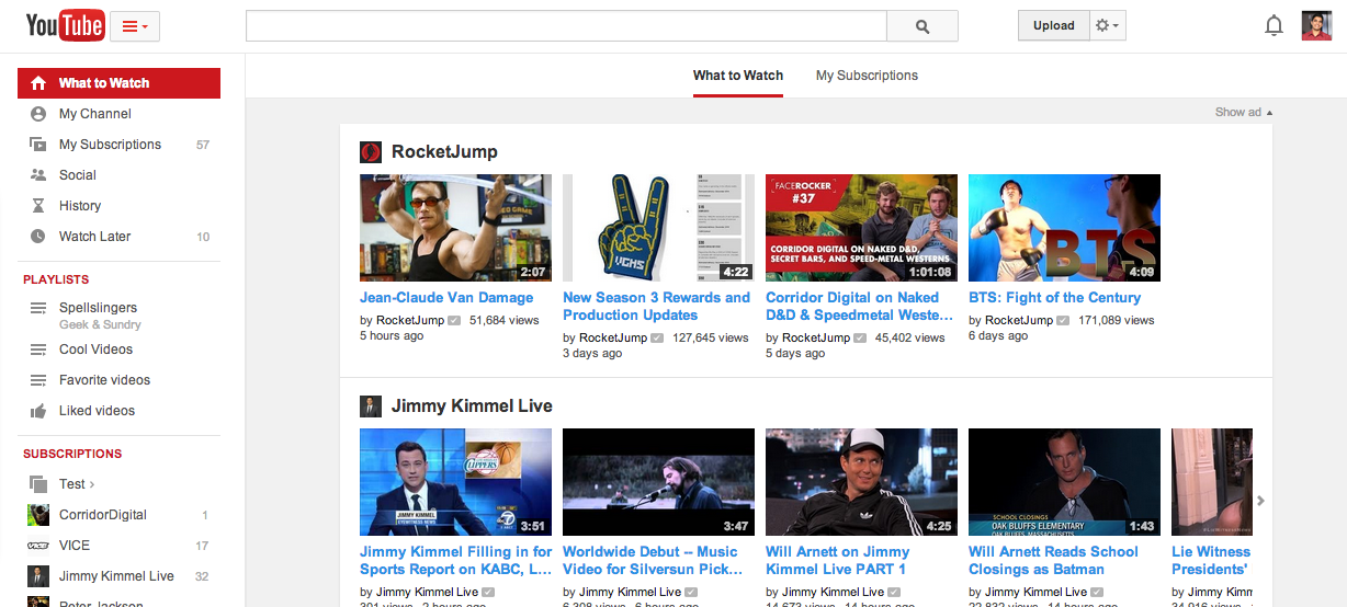
Earlier this year, Tech2Notify discovered that YouTube was testing a new look and feel on the service. A spokesperson at the time confirmed the report, calling it an experiment designed to “help people more easily find, watch and share the videos that matter most to them.” Based on the feedback that it received, YouTube is ready to roll this out to its global community, though it could take a few hours or days to get to you.
Photo credit: ERIC PIERMONT/AFP/Getty Images

Matt Winn is Volusion’s Marketing Communications Manager, where he helps oversee the organization’s branding and communications efforts.
Our current culture is riddled with mobile junkies addicted to their tablets and smartphones. While this newfound obsession has had quite the negative impact on dinner conversation, it does present a great opportunity for retailers to take advantage of this mobile fixation by providing a high-impact, enjoyable mobile commerce experience.
The problem? Far too many retailers make critical errors when it comes to mobile commerce.
Here are the top five issues you will want to avoid.
1. Overcomplicating your mobile homepage
The majority of your mobile traffic lands directly on your homepage, so you should direct visitors where you want them to go: deeper into your website.
Keep in mind that shoppers are interacting with your site via a much smaller screen, so having complex carousels or dramatic slideshows on your homepage can be highly distracting.
From a more tactical standpoint, the majority of shoppers use smartphones to browse and research products, so provide immediate access to your product categories.
Even more, overcomplicating your homepage can and will cause slow load times, which not only ranks as the number one user complaint for mobile sites, but also negatively impacts organic search results.
2. Convoluted checkout experience
Remember the last time you entered your name, billing information, shipping information and credit card number on a 4-inch screen?
The same cumbersome experience holds true for your mobile customers. That’s why, from a user experience standpoint, you should work to keep the amount of information required for checkout to a minimum.
With 66 percent of mobile shoppers failing to complete a transaction due to obstacles presented during checkout, removing barriers from the checkout process is a key function to increasing mobile conversions.
To do so, only require the most basic information, and even more, allow repeat customers (both from mobile and desktop) to log in and use saved payment information. This simple step will make the checkout experience much more seamless and efficient.
3. Predominantly highlighting QR codes
While QR (quick response) codes may seem like an innovative mobile marketing tool, consider it officially old school.
Long story short, QR codes ask a lot from users, including the following steps: recognize QR code, pull out mobile phone, launch QR scanner app (assuming they already have one downloaded), perfectly align mobile camera to QR code, snap picture, submit QR code, wait for response, then arrive on desired website.
Seems like quite the chore in this day of mobile apps and readily available mobile websites.
Unless you have experienced success with QR codes in your mobile marketing campaigns, shy away from them. Not only are they difficult to use, consumers don’t believe that scanning QR codes are worth their time, which can lead to negative associations with your brand.
4. Not embracing mobile-friendly, responsive email marketing
As of January 2014, 51 percent of email is opened on a mobile device. This means that if your email campaigns aren’t optimized for mobile, you’re making a huge mistake.
To get started, take a look at your email statistics over the past year to see trends in open rates from mobile devices. Even more, study your mobile click-through rates – if there’s a big gap in this metric between desktop and mobile, it’s time to make a change.
Fortunately, there are several email solutions that are easy to use and fully optimized for mobile. When looking at your options, search for technology that has built-in responsive design so all email content is guaranteed to render perfectly, regardless of device or screen size.
Speaking of content, keep your messages clear and concise, and avoid long bits of copy or overly complicated graphics.
Once you put these design and technology pieces in place, start benchmarking your email metrics to track progress and identify additional opportunities for optimization. After all, email marketing is one of the most powerful tools in your arsenal, so don’t ignore it.
5. “Unable to play/download on your device”
This one may seem like a no brainer, but it’s easily one of the most common mobile commerce mistakes: make sure that all content on your site, particularly documents and video, can be downloaded or played on a mobile device.
One far too common example of this comes from mobile sites using Flash, which presents a compatibility issue with Apple’s iOS, meaning that iPhone and iPad users can’t interact with this content.
This same story is true for PDF files on your mobile site – Apple and Adobe don’t play nice together, so many Apple users will be unable to download or review these documents.
Just as important, Google has directly stated that having inaccessible content is a top mistake for mobile sites – and if Google says it’s a mistake, you’d better listen.
Love or hate our mobile-crazed culture, you can’t deny the opportunity that this technology has to offer. To recap: keep your mobile site simple and uncluttered, focus on usability, and directly pursue the benefits of mobile marketing.
Once you embrace these pieces of advice, the mobile landscape will become your proverbial oyster.
What we can learn from the evolution of Content Management Systems
Feb20
on February 20, 2014
at 8:45 pm

Viktor Marohnić is the CEO and co-founder at ShoutEm, a self service mobile website and mobile apps creator, a ‘Wordpress for mobile apps.’
From banking software to cell phones, as markets develop and grow, more user-friendly products with fewer but highly-polished features are winning the game.
In the early stages of every technology, the market is usually dominated by products built for early adopters who are typically tech savvy – this mainly consists of developers who like to have full control over a product and its features.
Think back to the very first cell phones. Early adopters tend to be the most tech savvy members of the population; the average person found the mobile phones available on the market hard to use. A “normal” person was expected to have read the manual to learn how to use a new phone.
Accessing the Internet on a phone was doable, but the experience was pretty bad. I was one of those early adopters, but most of my friends looked at me as a freak who was doing some crazy stuff.
Steve Jobs is famous for wanting to build computers for normal people, and for making technology very simple and easy to use, but his idea fell onto fertile ground only when the tech market became mainstream. By the time everyone learned to use a mouse, handle a phone, use a computer, and send email, the market had become much bigger, and less tech savvy users started to use technology in everyday life.
The key to win those new customers was simplicity and intuitiveness. The first iPhone was so intuitive that three-year-old kids could use it.
Does that apply in software world?
The answer is yes. Your potential customer base grows as tools become simpler and easier to use, even non-coders can build a professional website with minimal effort.
At the same time, tools that until yesterday were considered “less professional” or “not advanced” are replacing the more complex tools originally built for developers and geeks.
One example that I’m familiar with and am following closely is CMS space. I didn’t really expect that consumer product evolution patterns will be so similar to software products – but the facts may surprise you.
A look at how CMS evolved
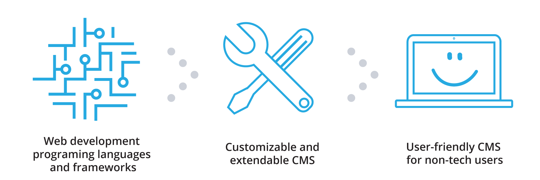
1st phase (late 90s, early 00s): New Web programming languages and frameworks

In 1995, I was the only one of my friends using email and there were no cell phones. Even those of us who were in our first year of computer science in college didn’t own a computer; instead we shared computers in a lab.
Compared to today, technology was used by a very small group of people.
At that time, websites were built using a simple text editor and HTML was edited manually. You would upload files to the server as static Web pages. To modify anything, you would edit your files and then go through the whole uploading process again.
As more websites began to have dynamic content, it became necessary to develop software that could generate HTML pages on the fly and modify the static files based on content that someone (typically a journalist) had input in a backend or that had been added by a user (on a discussion board).
Then, the first languages designed for Web development began to show up. Developers used PHP, Perl and similar programming languages to build websites.
One of the most popular frameworks in those days were PHP-Nuke and Zend, that was tightly coupled with PHP programming language.
In general, at the time, you had to be an engineer to even think about creating a website. If you wanted a website, you had to pay someone a lot of money to set it up for you. For us geeks, those were happy times, but the same cannot be said for end users.
2nd decade (early 2000): The First Content Management Systems (CMS)
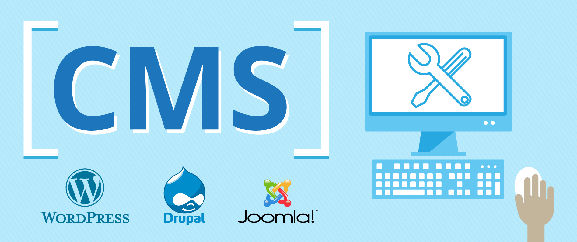
Once Mambo, Joomla, Drupal and similar systems entered the market, website creation sped up dramatically. You would install CMS on your server, select the template and have a site done in an hour.
However, those templates were usually ugly and limited. Tons of customization was required if you wanted to actually create something nice.
In 2003, another CMS, called WordPress, came into play, and with its plugin architecture, WordPress quickly won the hearts of the development community.
WordPress was very basic in functionality, as did most of the CMS in use at that time, but where WordPress really excelled was in enabling unlimited customizations and extensions to third party developers.
But even then, we were still talking about very tech savvy users using those tools. You didn’t need a hardcore engineer to set up a website for you, but you still could not do it on your own. WordPress was typically used by Web designers who learned to code or by self-taught developers.
3rd decade (2010): New generation of CMS targeting a wider market

A new revolution began when high-speed Internet connections became available to most of the developed world. More businesses needed a website and they needed it quickly. This demand led to the creation of a number of differently designed CMS aiming at mommy bloggers, artists and anyone who wanted to have a Web presence, which today is almost every living person.
At this time, the new kids on the block were tools like Squarespace or WIX, which were built for people who had no coding skills and had just started to use their computers. The new mantra became “simple, intuitive, easy to use.”
Even WordPress changed the marketing messages on its home page to target the more general public. WordPress’ original developer centric user base can still find all those resources on wordpress.org.
One system that currently stands out from the pack is the increasingly popular Squarespace. Squarespace’s beautiful templates require almost no customization and are very easy to use. Its very intuitive dashboard is getting lot of traction today among a wide audience.
Meanwhile, WordPress, which started as a tool for blogging and for powering small websites, is now offering a WordPress VIP package that powers some of the world’s biggest sites.
Big frameworks and enterprise CMS are starting to loose loosing the game against open source software and systems that were initially very basic tools built by visionary kids.
Similar stuff is happening in the e-commerce arena. Shopify also started as very basic but extremely easy to setup e-commerce solution. There was a point in time when, if you were to propose Shopify to a serious Web development agency, they would laugh and proudly display their Magento partner certificate.
But today more and more agencies are using Shopify because it is easier to set up and has almost everything their clients need to run an online store. Again, simplicity and ease of use wins in a long run.
So what we can learn?
Think twice about who your target audience is. Do you want to play for the long run or do you want a quick exit? Is your market going to be big or will it remain very niche oriented?
The answers to all these questions should affect your decisions about how and for whom to develop your software.
If you think the need for your software is going to be big in five or ten years, think ahead – and plan on designing user-friendly software that even your mom can use.