


HP’s ‘new’ logo was actually rejected five years ago
Apr05
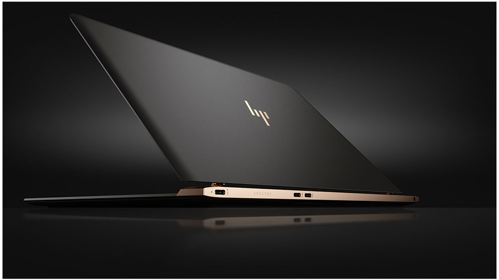
HP’s premium laptops will have a new logo — sort of. While what users see is technically new to their eyes, it’s actually one HP rejected five years ago. It’s just four slanted lines, but the branding is still quite clear. Instead of a fully scripted ‘Hewlett Packard’ or distinct ‘hp’ letters, the four lines merely suggest ‘hp’ to your eyes. The “new” logo was actually submitted in 2011 by Moving Brands, which was hired by HP to refresh the brand. the original four-line logo may have been too futuristic for HP, but times have clearly changed. The logo can…
This story continues at The Next Web