Study shows all of your iOS and Mac app icons really do look the same

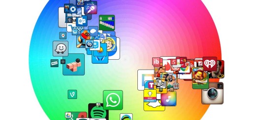
Have you ever thought to yourself ‘all these iOS app icons look the same’? If so, you’re actually onto something. A new study by Appbot reveals that all icons lean toward the same colorways. Blue and red seem to dominate the icon landscape, with green making a healthy showing. As you can see from the diagrams below, there’s some brave apps that venture into different color schemes, but not much. Apps are often comprised of multiple colors, so how can we say they’re blue or red? Appbot took each color of an app, and plotted it on the color wheel…
This story continues at The Next Web


