


Google tidies up its Maps with new icons and color keys
Nov15
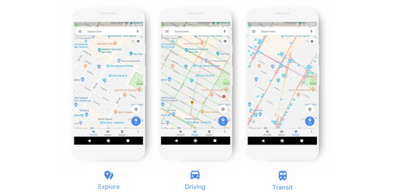
Google today announced it’s bringing a new look to Maps. The new experience has brighter colors, clearer icons and an overall improved user experience. Over the next few weeks users will be introduced to new color keys and icons depending on the category, such as orange for food and drink and pink for health. This comes as an upgrade to the old design, where it was easy to mix things up as icons were small and similar in color. The idea is that now users can easily spot what they’re looking for. For example, if you’re out of town and…
This story continues at The Next Web
Or just read more coverage about: Google