


Twitter for Android may soon have a new Material Design look
Apr14
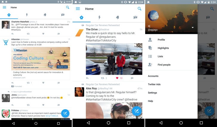
If you’re using Twitter for Android — and hate the layout — things may soon be changing. Some beta testers are noticing a new-look Twitter with a bunch of Material Design cues. In the redesigned app, Twitter’s four main areas — feed, Moments, notifications and direct messages — are still at the top of the screen, but you can navigate between them by scrolling left or right on your screen in addition to tapping on the icons. A new slide-out menu is also in testing, which takes much of what’s currently hidden in the ellipsis menu and makes it easily…
This story continues at The Next Web