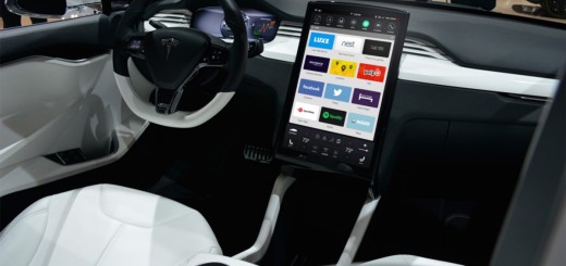
This is how Tesla’s dashboard should look

There’s been plenty of talk about Tesla’s upcoming dashboard redesign, but rather than waiting I thought I’d take a stab at a visual overhaul of their current dashboard. The current dashboard UI was quite revolutionary when it first came out, but it’s definitely showing its age with its skeuomorphic visual cues. Buttons looks like physical buttons, while icons are given embossed 3D treatments. Tesla’s current dashboard design When approaching the redesign, I wanted to keep the UX more or less the same, and focused on reducing the UI chrome and visual noise. I wanted the dashboard to have a clean,…
This story continues at The Next Web


